Marais
Art Director - Midnight Design
Design - I Chan Su、Yi Gu
Interior design - 甘納設計
Typeface - 思源黑體
Client - Marais
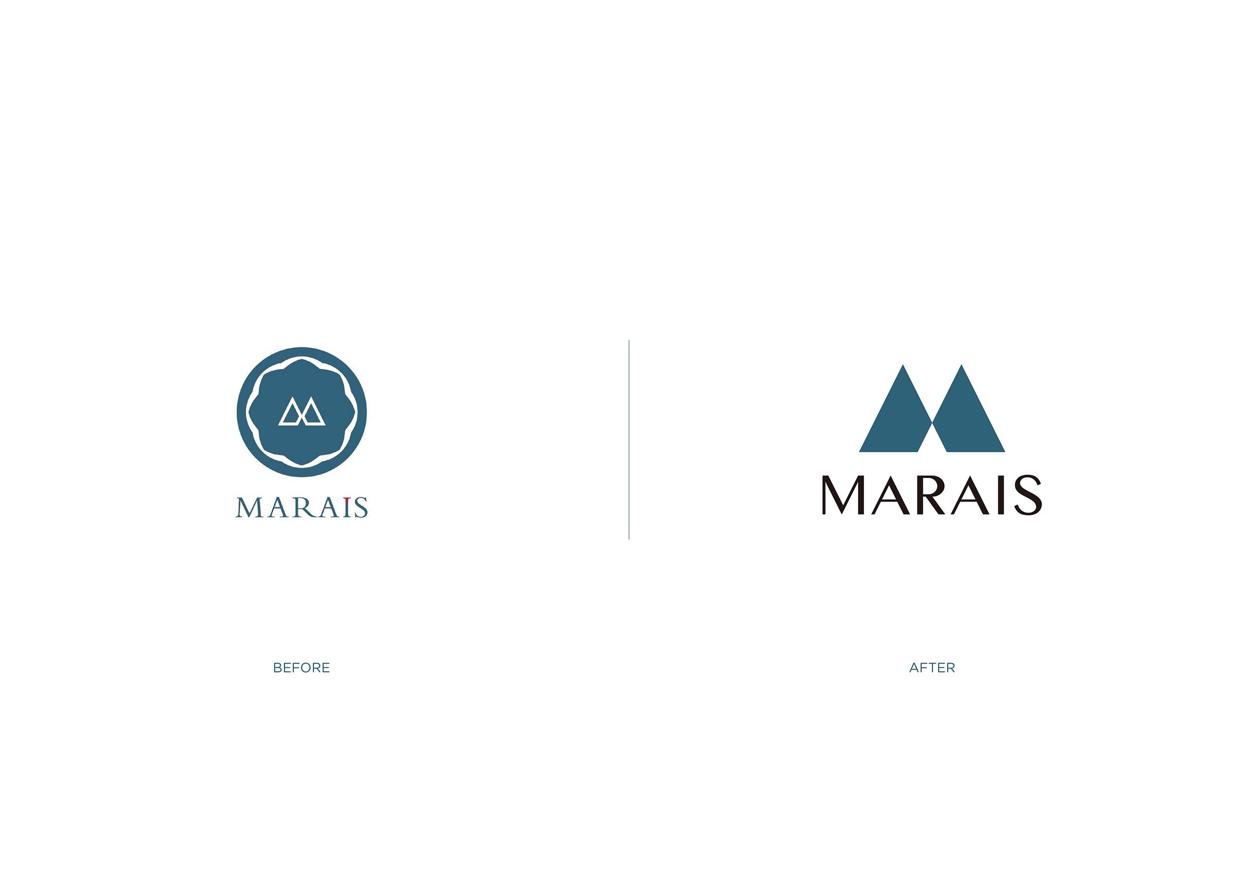
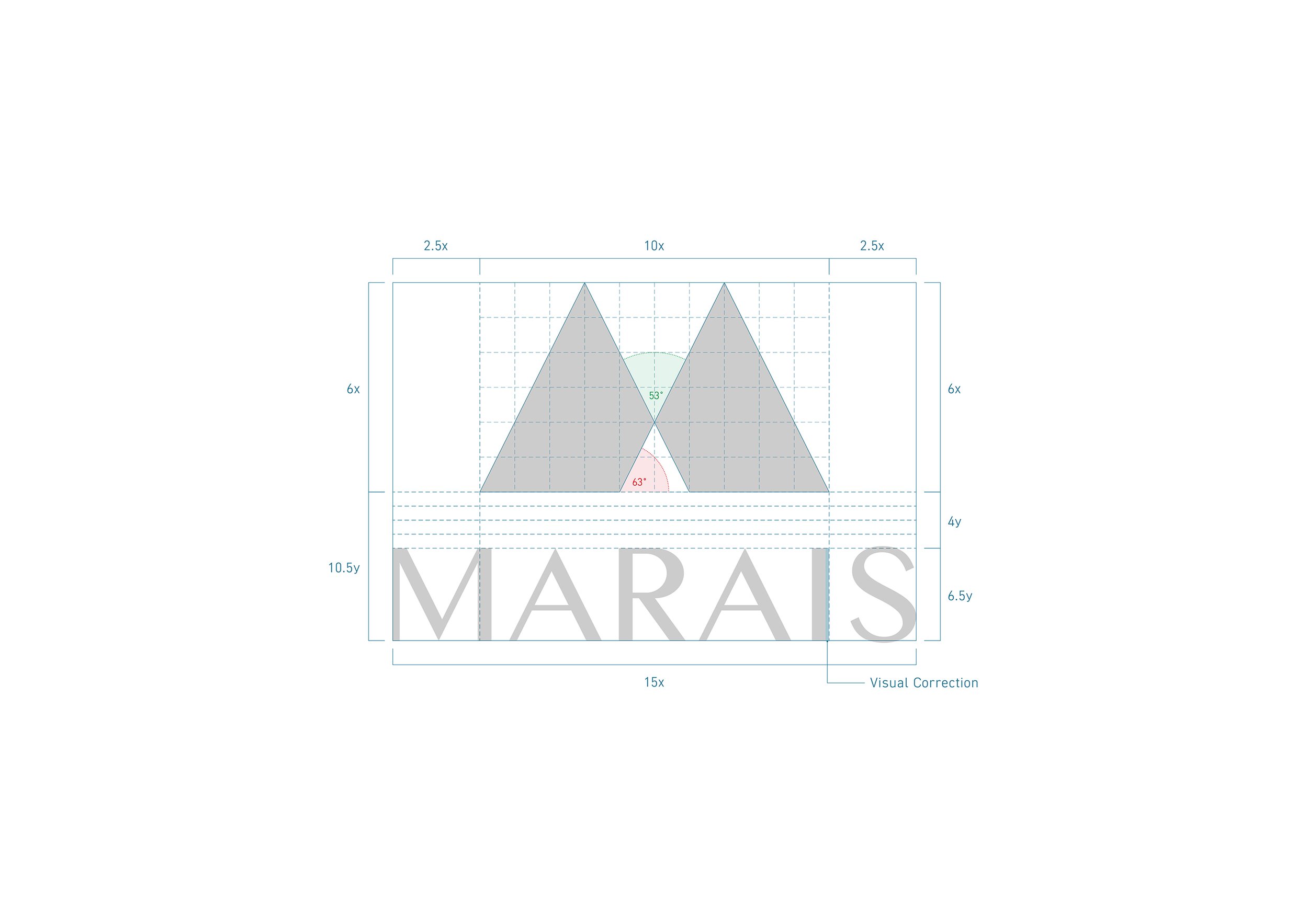
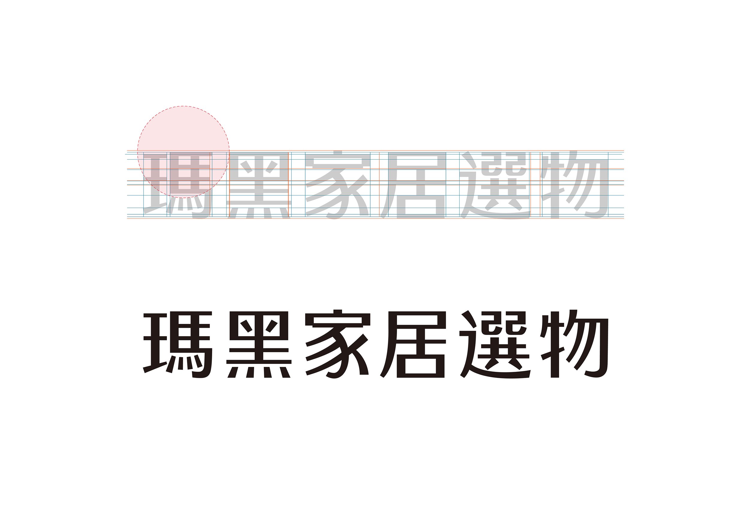
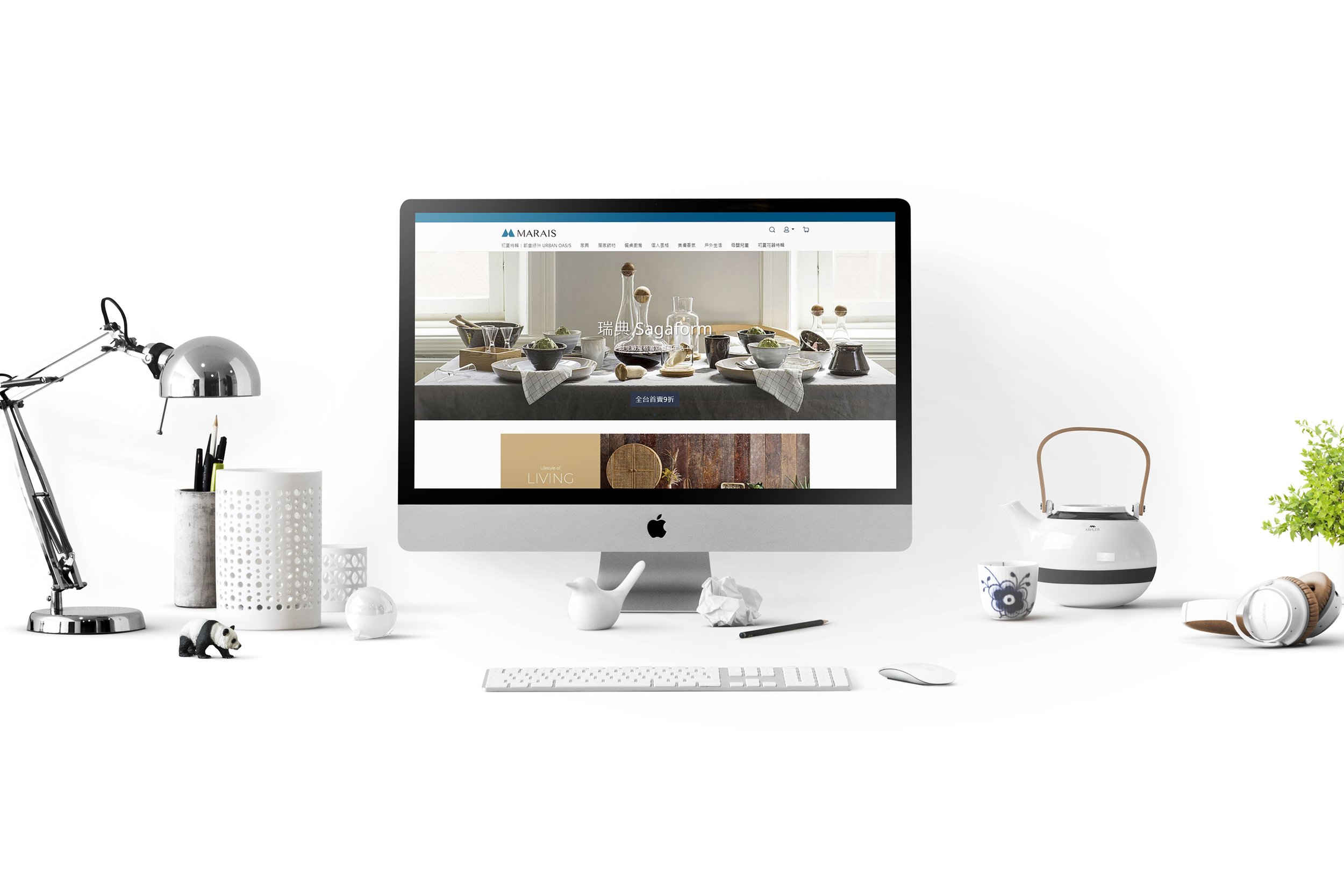
對美抱有熱忱的 Marais 瑪黑家居選物,希望能與新時代的消費族群有新的連結點,於是選擇了品牌再造 (Rebranding) 進行視覺形象的優化。設計上透過減法的方式將標誌的呈現更加現代俐落,並重新制定色彩計畫及中英文標準字設計,除了延續品牌精神外,更能精準的使 Marais 與人之間創造嶄新的品牌記憶。
Marais, household supplies, passionate about beauty, chooses Rebranding to optimize its visual image due to the hope of making a new link with the consumer group in the new era. Through the method of subtraction in design, the logo is presented in a more modern and concise way, and the color plan and typography of Chinese and English are redesign. In addition to the lasting of the brand spirit, it also created a brand new memory between Marais and customers in a much more accurate way.
