SPACELABZ
Art Director - Midnight Design
Design - I Chan Su
illustration - I Chan Su
Client - SPACELABZ
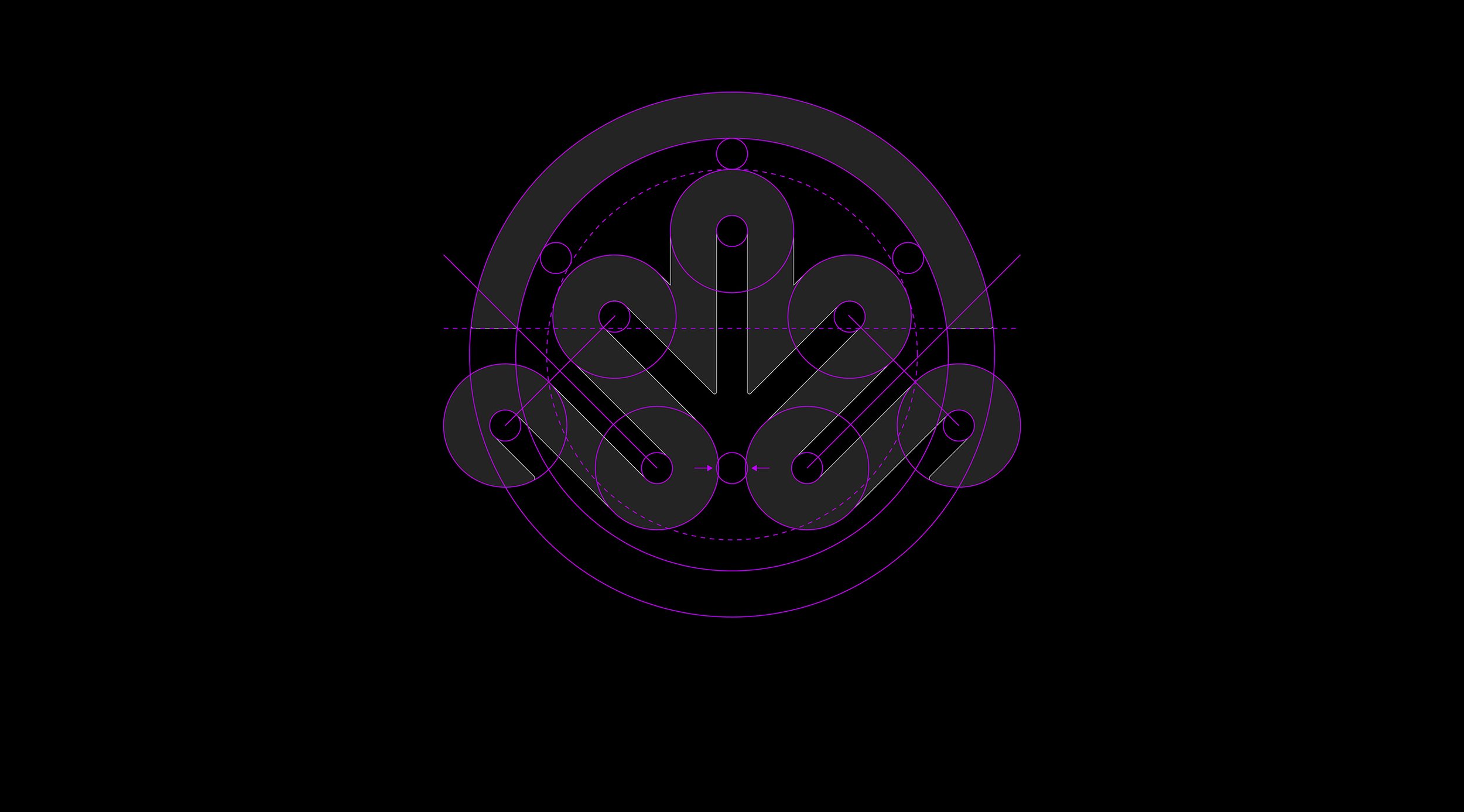
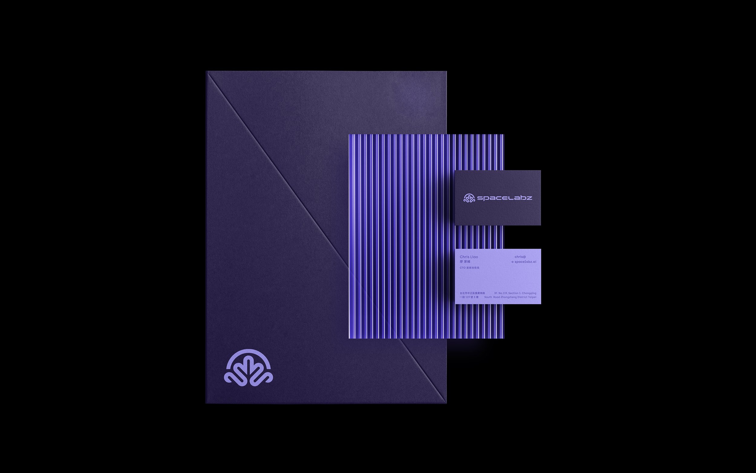
Spacelabz 致力於推動 AI 新領域,站在科技尖端,不斷挑戰極限。核心能力包括神經網路、先進演算法和虛擬環境。站在科技尖端,致力於推動 AI 新領域的 Spacelabz ,以宇宙探索為核心理念,選擇壟罩著神秘色彩的海洋生物「水母」作為品牌設計核心,複數的觸手象徵多元發展的精神本質。 圖標設計將水母與象徵 AI 的腦袋結合,並將英字首 S 與英字尾 Z 相繼融入觸手的末端,透過正圓與45°斜線相互構成的輪廓,顯現前衛的現代風格,成為引領數位世代的先行者。 品牌標準字延續了品牌圖標的設計脈絡,選用厚實的無襯線字體作為基本架構,寬拓扁平的骨架比例展現未來感;筆劃轉折處及末端皆同樣參照圖標的構造特色,確保完整一致的風格調性,體現專業內斂的品牌形象。
Spacelabz is dedicated to advancing new frontiers in AI, standing at the cutting edge of technology and constantly pushing the limits. Its core competencies include neural networks, advanced algorithms, and virtual environments. Standing at the cutting edge of technology, Spacelabz is dedicated to advancing new frontiers in AI. With space exploration as its core concept, it has chosen the mysterious marine creature "jellyfish" as the central element of its brand design. The multiple tentacles symbolize the spirit of diverse development. The icon design combines the jellyfish with a brain symbolizing AI, and integrates the English initials S and the final letter Z into the ends of the tentacles. The outline, formed by a perfect circle and 45° diagonal lines, showcases a futuristic modern style, making it a pioneer in the digital age. The brand's standard typeface continues the design context of the brand icon, using a thick sans-serif font as the basic structure. The wide and flat skeleton proportions exhibit a sense of futurism; the strokes' turns and ends also reference the icon's structural features, ensuring a complete and consistent style tone, embodying a professional and understated brand image.


